Responsive Game UI
Published on 2023-03-29Designing a UI for a variety of screen sizes is always interesting. We have a lot of tools to make responsive design much easier to reason about and work with these days, but a lot of the time, elements simply can't be mapped 1:1 from a regular monitor to a mobile device to an ultrawide.
One particular domain where this is extra interesting, in my opinion, is gaming. UI heavy games in particular. You already have to struggle with asset scaling across screen sizes, but UI is a whole 'nother beast. Bit Dungeons is an RPG, and with that comes a lot of stuff that wants to be on screen. Health bars, chat window, a skill bar, a set of icons for accessing the menu or other important features, and so on.
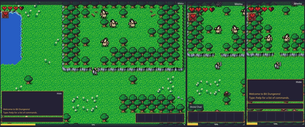
This is the current desktop view vs. mobile view - which I think is pretty clean.
 Desktop vs. Mobile
Portrait vs. Landscape
One of the challenges is landscape vs. portrait. Unfortunately, I can't just use the widescreen design from desktop for landscape. Most elements need a specific landscape and specific portrait design; the skill bar is a pretty good example here.
It's pretty long, and almost feels like it would be better if it were split into two sets: 4 on the right and 2 on left. Of course, chat is over there, and that really can't be moved anywhere else. So, I'm not sure what the best solution is here.
Currently, I've decided to just scale down the desktop view for landscape and hope it mostly works, while I invest time into designing a strong portrait experience. I like the "game feel" of portrait more for Bit Dungeons - it's a more "on-the-go" experience, and I think that's a good fit for the game. I like being able to play with just one thumb.
Stacking vs. Closing Competing Elements vs. Full Width
As far as handling many elements goes, my current strategy is to just overlap everything - with the latest window taking z-index priority. This has a huge downside of becoming quite messy when multiple elements are visible, however.
One solution I've thought about is closing competing windows (eg. closing the chat if you open inventory), but I'm not completely convinced that's the right move yet. I will definitely be experimenting with it.
I don't want to hide the game world completely when windows are opened - for a few reasons - so I definitely don't want to go down the route of making most elements take up the entire width of the screen, though I know that is a valid solution some games employ.
Of course, this is all iterative and super early in the process, so I'm sure things will change considerably as I continue to work on it. Especially when new elements need to be brought into the fold.